Sacred Living
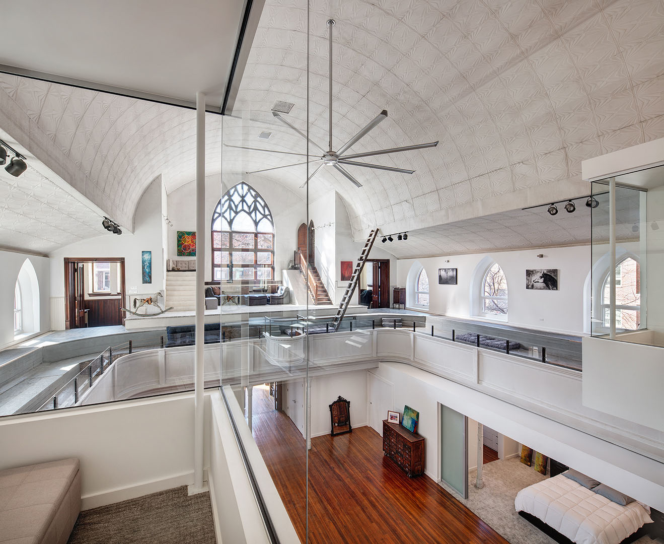
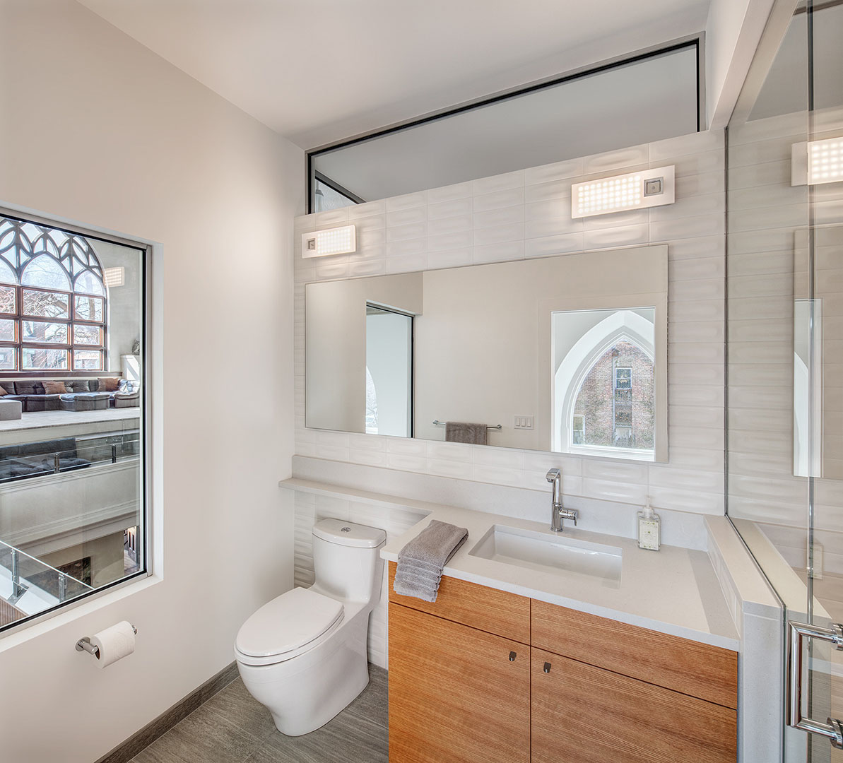
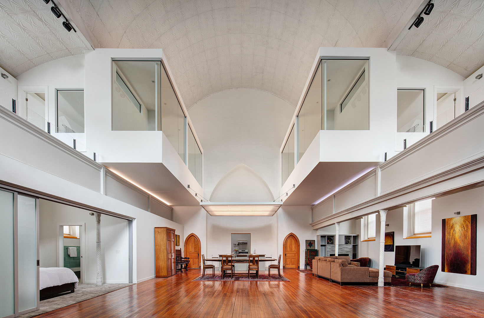
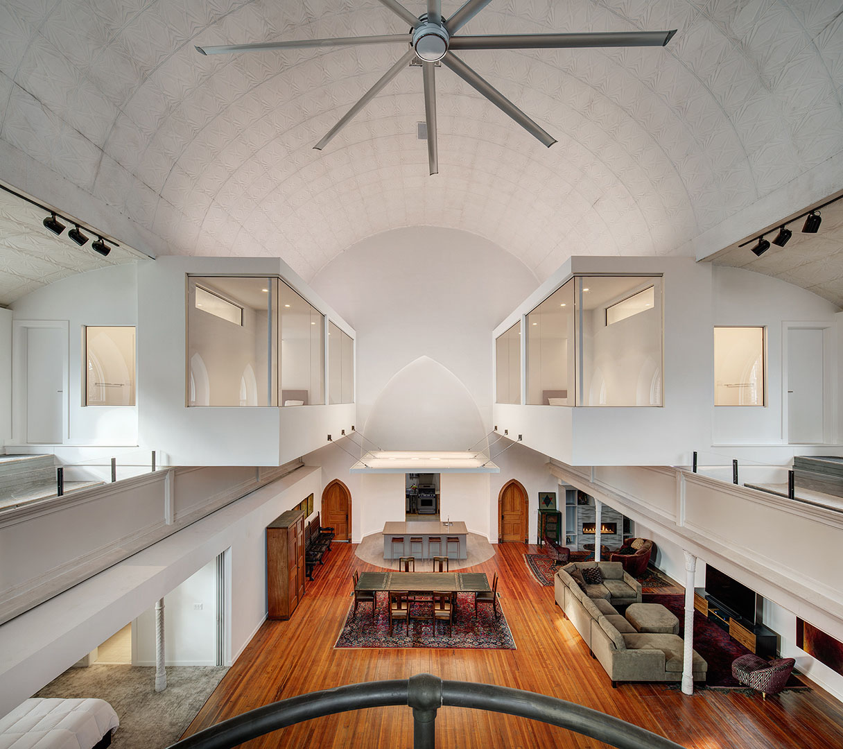
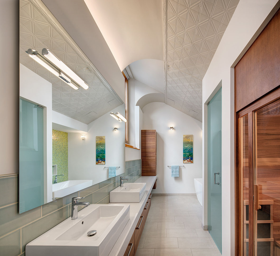
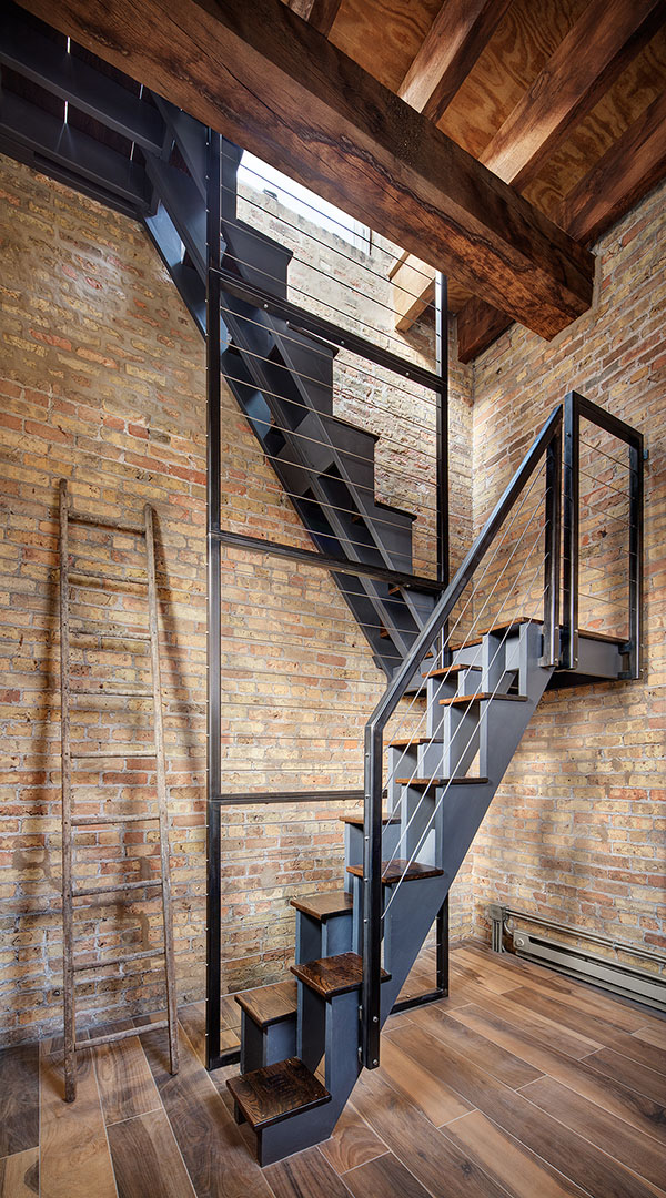
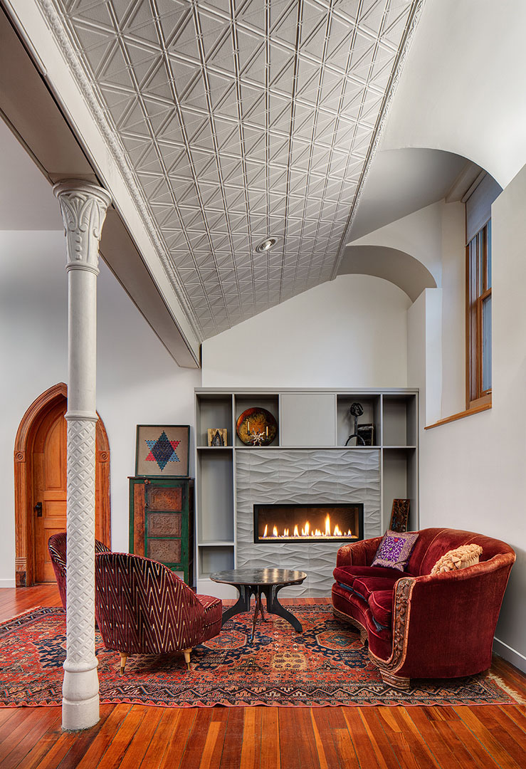
Although the interior space is voluminous, the Owners of a church (who had made the building their home for several years) felt they had little space in which to live. They loved the quality of the sanctuary but the scale of the central nave and shallow symmetrical side-aisles didn't offer the comfort and enclosure they sought for intimate spaces like bedrooms and baths. The project, therefore, involved adding two guest bedroom suites, and renovating their master bedroom and bathroom. They also wanted to inhabit a raw, pigeon-infested bell tower.
Three questions were raised during our initial analysis. How should we respond to the heaviness of the massive masonry exterior walls that contrasted to the lightness of the interior? How could our intervention moderate the scale of the interior? Lastly, how should the language of the new work develop in relationship to the existing?
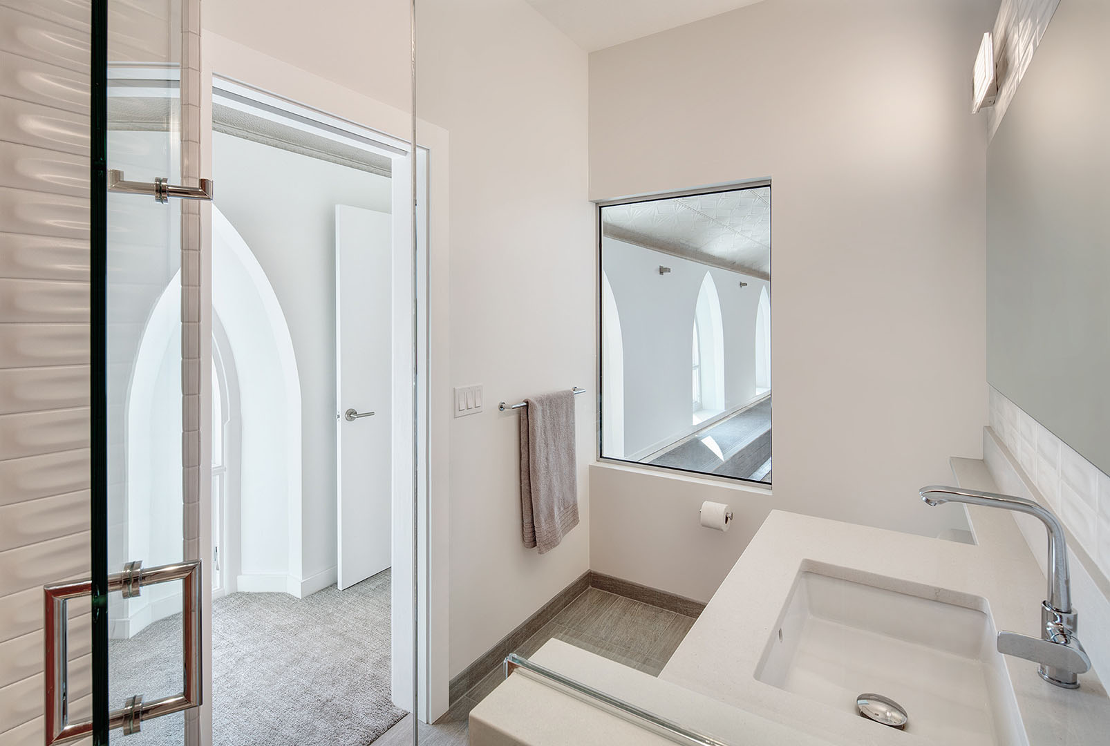
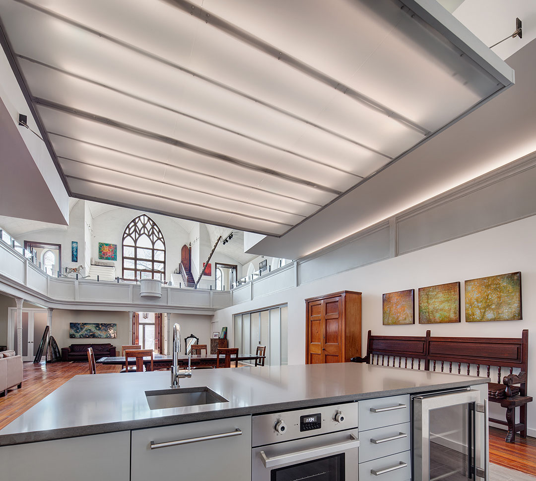
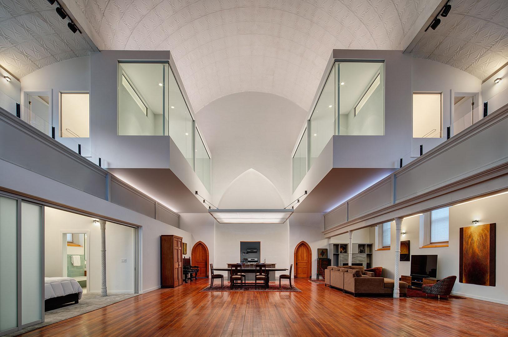
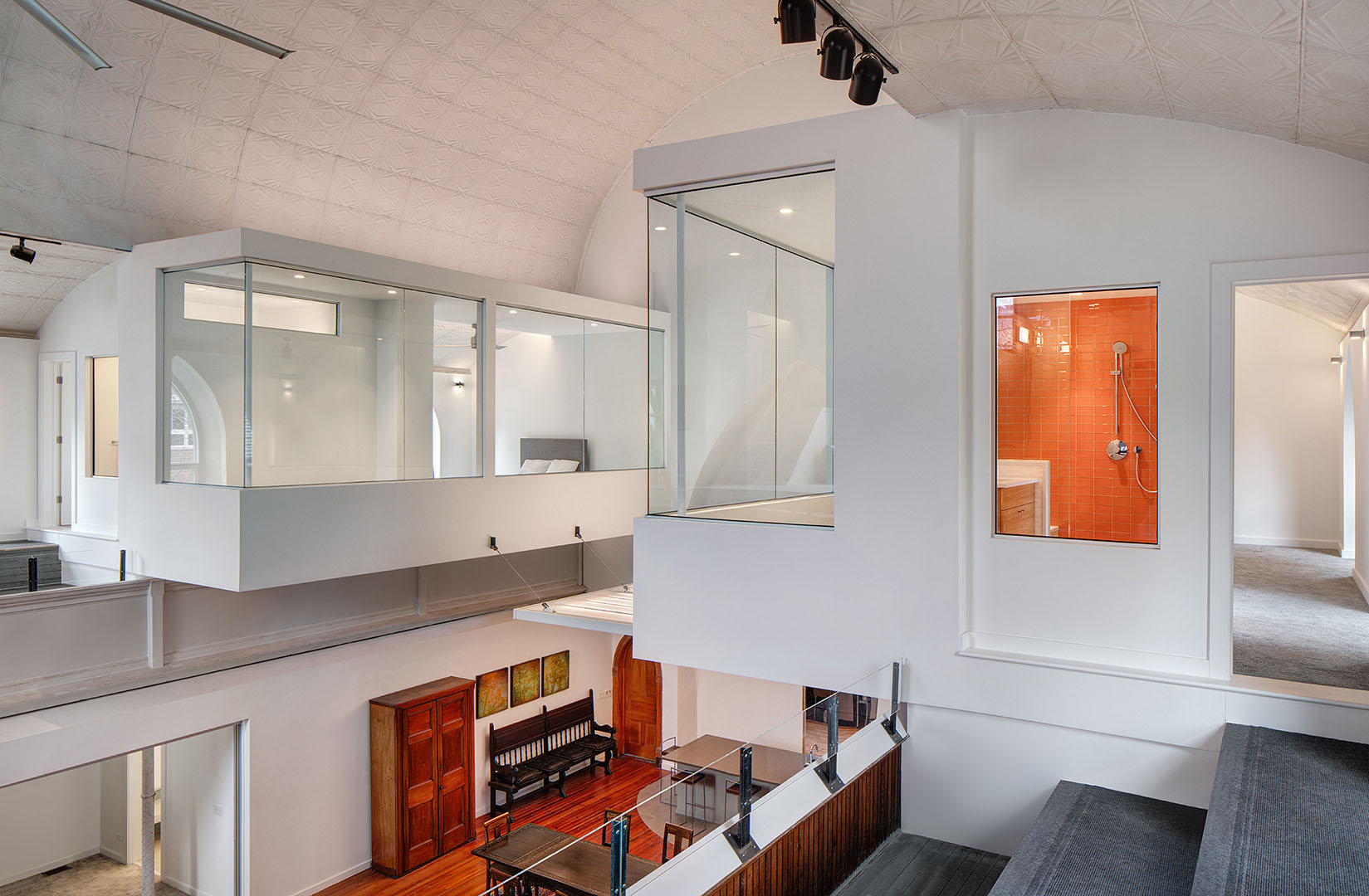
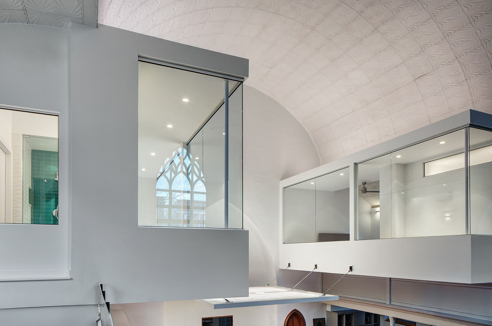
To respond to these questions, we designed the new elements to purposely contrast with the old. The lightweight, glassy cantilevered guest bedroom cubes hang off the existing balconies, floating over and framing the nave. This overhang establishes a compressed ceiling height below, more comfortable for casual seating and gathering. A taut illuminated horizontal plane floats between the cubes, and LED lighting fills the reveal to further enhance the ‘hovering.’ Cladding the new overhanging volumes in glass, the transparent elements glow in the evening, and reflect the iconic church windows during the day.
Location Chicago
GC Rock and Wall Construction
MEP Engineering BES Engineering
Structural Engineering Johnson, Wilbur, Adams
Photography Darris Harris
Size withheld
Adaptive Reuse, single-family home
